This spring I went through a bit of an identity crisis, and no, I’m not talking about myself this time! Instead, my feelings were directed towards the visual identity of the things I put out to the world under The Last Stitch name. It lacked direction, and I kept changing up things all the time and really struggled to create a cohesive look.
And when I talk about visual identity, I’m referring to things like the covers of my books, my sewing pattern covers, my YouTube-thumbnails and even my logo. As we say in Sweden, my brand lacked a red thread, i.e it had no easily identifiable signifier, and I had started to resent the graphic design work since I felt it lacked direction.
Up until that point, I had done pretty much all myself. But I have also done graphic design work on and off as part of my day jobs for over two decades, so I have the basic skills and a decent visual eye. But I’m not a trained graphic designer, and I think that shows!
So after struggling with what do to moving forward, I decided to hire a professional designer. Enter Fatema Poonawala, who I found in a Facebook group for creative entrepreneurs. I resonated with her style immediately, as I wanted something that was graphically refined but still looked fun and exciting.
So let’s take a look at the changes in my branding that Fatema created
The log and sub-logo


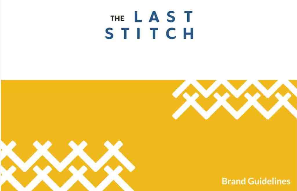
New colour palette

The blog


Updated blog look. I still use the same WordPress theme, so the changes are not massive. But I made it cleaner and brighter.
Book covers


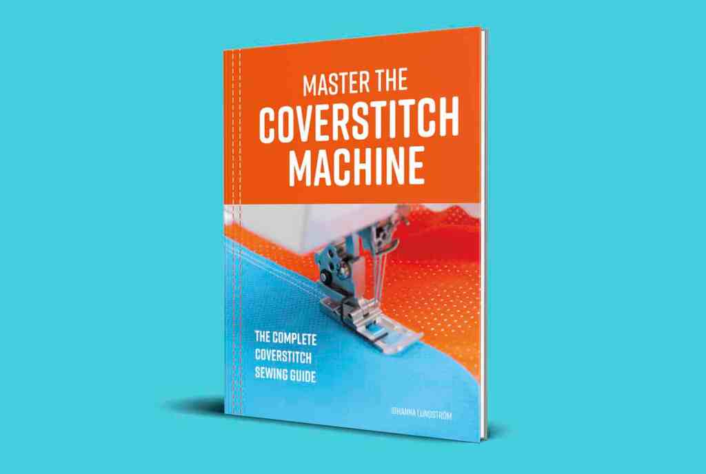
The biggest change is to my coverstitch book. While I did like the bright orange cover, and it really stood out on Amazon, it was not cohesive with the rest of my brand, so I made some changes so that my upcoming books will have a cohesive look.
YouTube


I really wanted to create an upbeat, fun look for my YouTube-channel. On YouTube bright colours work better than muted for the most part, and Fatema created a look that felt totally right for the medium.
Pattern covers


My current sewing pattern collection consists of three patterns, with more to come this year. So having the covers reworked felt like a great push for me to create more sewing patterns.
So while this was an investment, I am so happy that I had the courage to reach out and hire a professional. Now I have an art direction and rules for everything I do, so no more messing around. And If you are looking for a very skilled graphic designer I can highly recommend reaching out to Fatema (and say that I sent you 🙂 )

The biggest thing about working with a graphic designer is that it has given me a new energy around the work I do on The Last Stitch. Some of most fun work days this summer was the days I spent implementing her design changes. Just writing this blog post make me think of far I have come, since I started this process earlier this year.
So what do you think about my visual look? The brief was about creating a clean, energetic look that was still rooted in my Scandinavian heritage, There are even more changes in the pipeline, and I have even more cool things that Fatema designed for me that will pop in different formats in the future.
Hope you enjoyed this behind-the-scenes look. I love reading about this kinda stuff myself, and I hope you do to!


